Designing for Sally: Turning Dashboards into Decision-Making Tools for Impact-Driven Employers
Internal tooling impact
B2B2C
Modular design
👀 Overview
The Control Center is a foundational internal platform employers use to manage employee programs, benefits, and content. While robust in function, its homepage had grown into a fragmented patchwork of static data and competing priorities—leading to cognitive fatigue and low engagement.
I led the redesign of the homepage into a personalized, task-focused dashboard that helps users prioritize work, understand key metrics, and feel in control.
Timeline: Dec 2024 – Apr 2025
Team: Sr. Product Designer, Product Designer,
Product Manager, Engineer
Role: Product Designer
🤯 Before: Sally was stuck in a cluttered homepage. It was designed to show everything—yet made it difficult to do anything.
Employers used the tool to make time-sensitive decisions across programs and platforms. But:
There were plenty of ways to take action—but no insight into how those actions impacted employees, leaving users unsure of where to focus or how to drive meaningful outcomes.
Even when insights were available, there was little guidance on how to act on them or tie them back to employee outcomes.
There was no visual hierarchy guiding what mattered now.
"It shows a lot… and it makes it hard to do anything."
– Internal feedback
How might we help Sally move from confusion to clarity the moment she logs in?
🧭 Insight to Action: Reframing the Experience
I shifted the focus from passive information to active decision-making. Instead of asking “Where do I find X?”, I asked “What should I act on today?” That single change grounded every design decision moving forward.
Prioritize action over passive data
Make insights digestible and dynamic
Support personalization based on recent activity
Surface only what’s essential upfront
Design for configurability and scale
My target contributions:
→ Led homepage architecture revamp through wireframes and Miro mapping
→ Introduced the Action Center concept to surface time-sensitive tasks
→ Defined modular card system for personalization and flexibility
🔄 My Design Process
I followed a flexible but focused design loop throughout this project:

Combined visual of early research inputs—including stakeholder feedback, competitive references, and usability takeaways.

Detailed journey map showing the employer experience across awareness, action, and engagement stages—highlighting unmet needs, emotional drop-offs, and missed opportunities to deliver value.

Early wireframes exploring grid structure, layout hierarchy, and different ways to balance task focus with data density.

A reference board of content types, legacy screens, and brand elements used to align design with business goals and user expectations.
💡 Making It Work — My Design Solutions

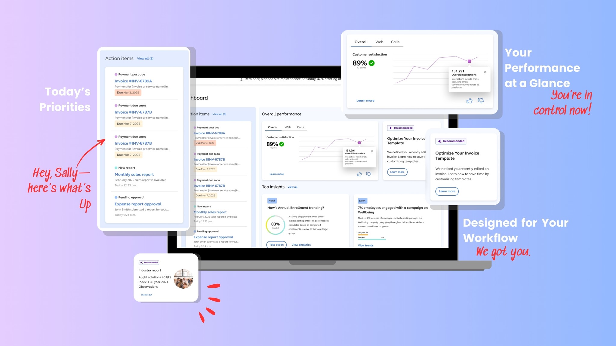
📌 The Action Center – Prioritize, Don't Just Present
Surfaces critical tasks like approvals, IMT notifications, and payment updates—ranked by urgency. No more digging, just doing. We tested one version that grouped by category and one by urgency. Urgency-based sorting received better feedback.


🧱 Modular Cards – Design for Scale
Three client tiers: Full (all insights), Mid (insights + performance), and Lean (action items only). This ensured easy configuration without requiring full redesigns for different clients.

✨ Contextual Help – Support Where It’s Needed
Inline help and tips appear only when needed—linked to the user’s active tool or data view. Inspired by the principle of progressive disclosure. We also surfaced intelligent suggestions like optimizing invoice templates based on recent activity.

📊 Tabbed Insights – Engaging Data
Converted static, overwhelming cards into interactive, digestible components. Visual hierarchy and tabs help reduce cognitive load and allow fast comparisons. The top insights section anchors users with meaningful direction.
The dashboard supports both micro and macro decision-making. Whether a user has 5 minutes or 2 hours, the layout provides a direct path to productivity and insight.
🚀 From Static Screens to a Strategic Starting Point
Before
After
First Impression
Sparse, text-heavy layout with low visual hierarchy and minimal guidance
A welcoming, modern layout with structured sections, visual clarity, and a clear starting point
Task Awareness
Action items were buried or siloed across tabs
Action Center makes time-sensitive tasks visible and contextual right from login
Insights
Dense tables and disconnected metrics
Digestible insight cards with guidance, trends, and direct next steps
Support + Navigation
Static links with little integration
Integrated Help Center, Quick Links, and proactive system messages (e.g., downtime alerts)


Before (left): A minimal interface with limited hierarchy and disconnected experiences. During (middle): Wireframes during exploration.
After (right): A personalized dashboard that brings together action, insights, and guidance
🔧 Constraints, Challenges & Collaboration
I designed a dual-path solution: one version buildable now, and a future version with advanced features.
A client insisted on an action item calendar, but I pushed back—showing how critical action-item surfacing offered more value.
Regular peer reviews helped me keep clarity and accessibility at the forefront, balancing business goals with real user needs. We carefully crafted microcopy—using terms like "Take action" or "Recommended" to subtly guide intent.
📈 The Impact
And… it paid off.
What started as a cluttered, feedback-heavy interface turned into a bold bet on user-focused design. Despite tight deadlines and legacy constraints, we delivered a homepage that earned stakeholder praise, inspired internal adoption, and set a new standard for what a dashboard should feel like.
Clarity in action: Employers no longer dig through data — it surfaces to them, prioritized.
Faster workflows: Personalized entry points reduced navigation friction significantly.
Endorsed by leadership: Became the reference model for all future internal dashboards.
Shared across teams: Presented as a showcase of scalable UI and thoughtful design.
Hypothetical KPI: Time to complete top tasks ↓
Increased interaction with Action Center & Top Insights ↑
Reported clarity and satisfaction in stakeholder sessions ↑
“Sally sees a trend, takes action, and sees impact—all from her homepage.”
– Leadership
✨ Reflection
This project helped me grow from a visual problem-solver to a systems thinker. I learned to communicate vision under constraints, push for clarity with impact, and design not just for what exists—but for what's next.
In hindsight: I would’ve loved to test more interactions for the help zones—especially for users onboarding for the first time. It’s a future iteration I’m excited about.